Right At Home Realty
Re-positioning & Re-fresh
February 2019
I worked with Right At Home's Director of Marketing to update and renew the creative direction of their current marketing materials. The goal was to bring the marketing materials in line with current design aesthetics and to make sure appropriate targeting of the growing audience, while expressing their brand values. Right At Home is well-recognized and established brand so changes to naming and visual identity (logo) were not on the table for revisiting.
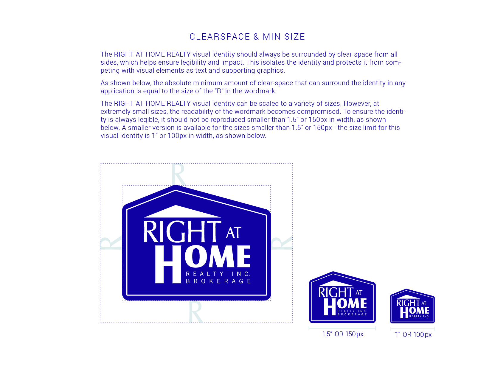
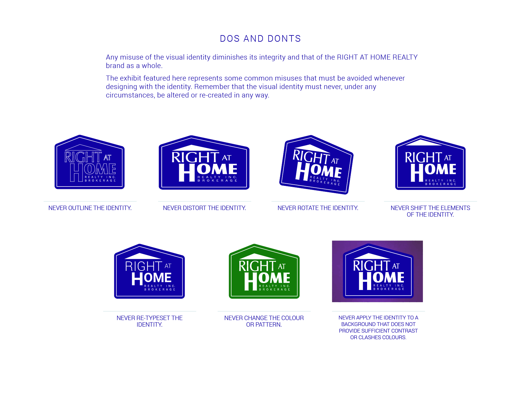
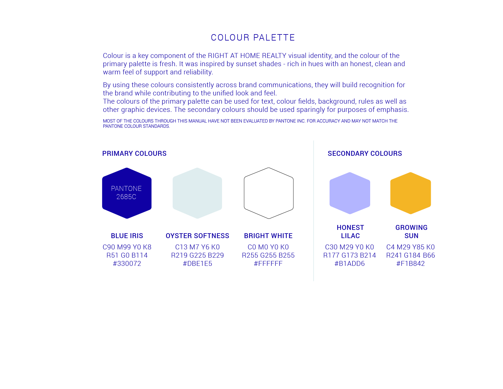
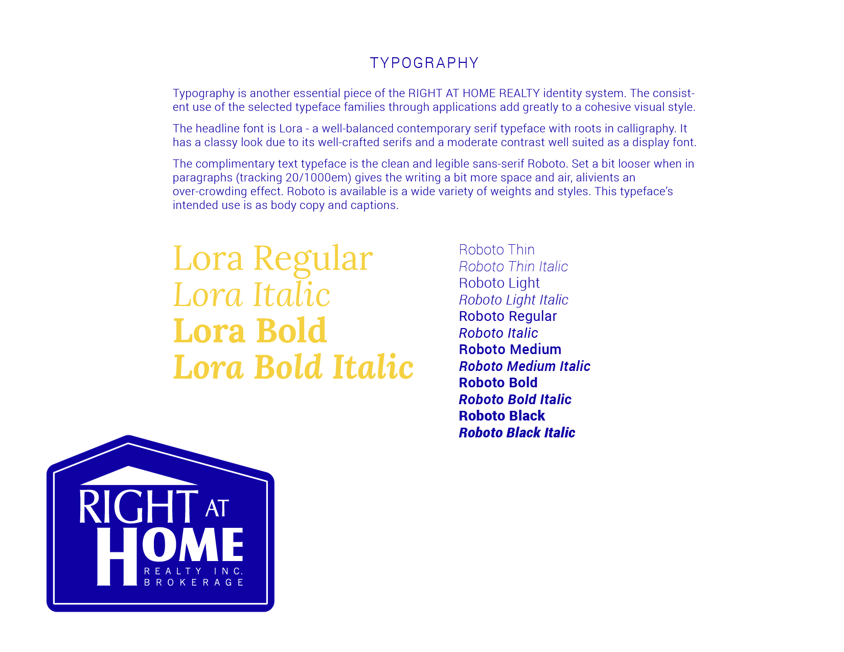
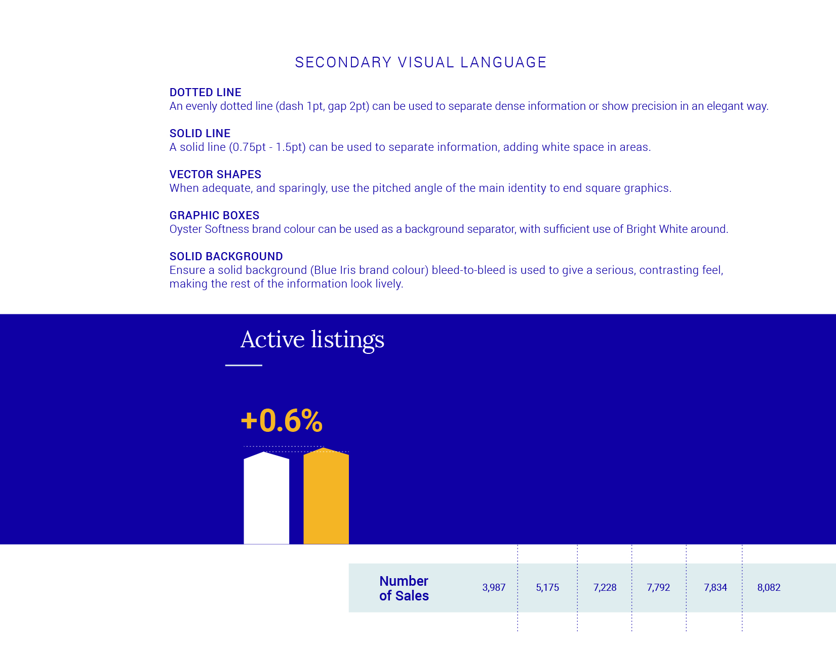
We focused our efforts on redefining the brand standards first to uncover the new way to present the company - setting a creative direction for the brand. Furthermore, brand standards solidify a path to ensure the communication style is consistent throughout all materials. The following aspects were defined in the process: logo spacing and sizing, secondary colors, font combinations, photography treatment as well as graphic elements.

Communications
Here are the before and after for the many documents which were updated after.
Monthly Market Trends Report
Recruitment Handout - Board Fees
Recruitment Handout: Commission Advantage
Recruitment Handout: Reasons to Join
Flyer Ad
New Employee Facebook Announcement


