mw Brand Redesign
January - April 2016
Mackaywong was in need of a re-brand as time was catching up with the previous brand identity and the company wanted to signal an update to their work ethic and organizational vision. Upon me joining the company, the re-branding effort became my number one priority. I contributed to the brand definition and strategy before diving into the visual brand representation.
Guiding Principles
WORDMARK
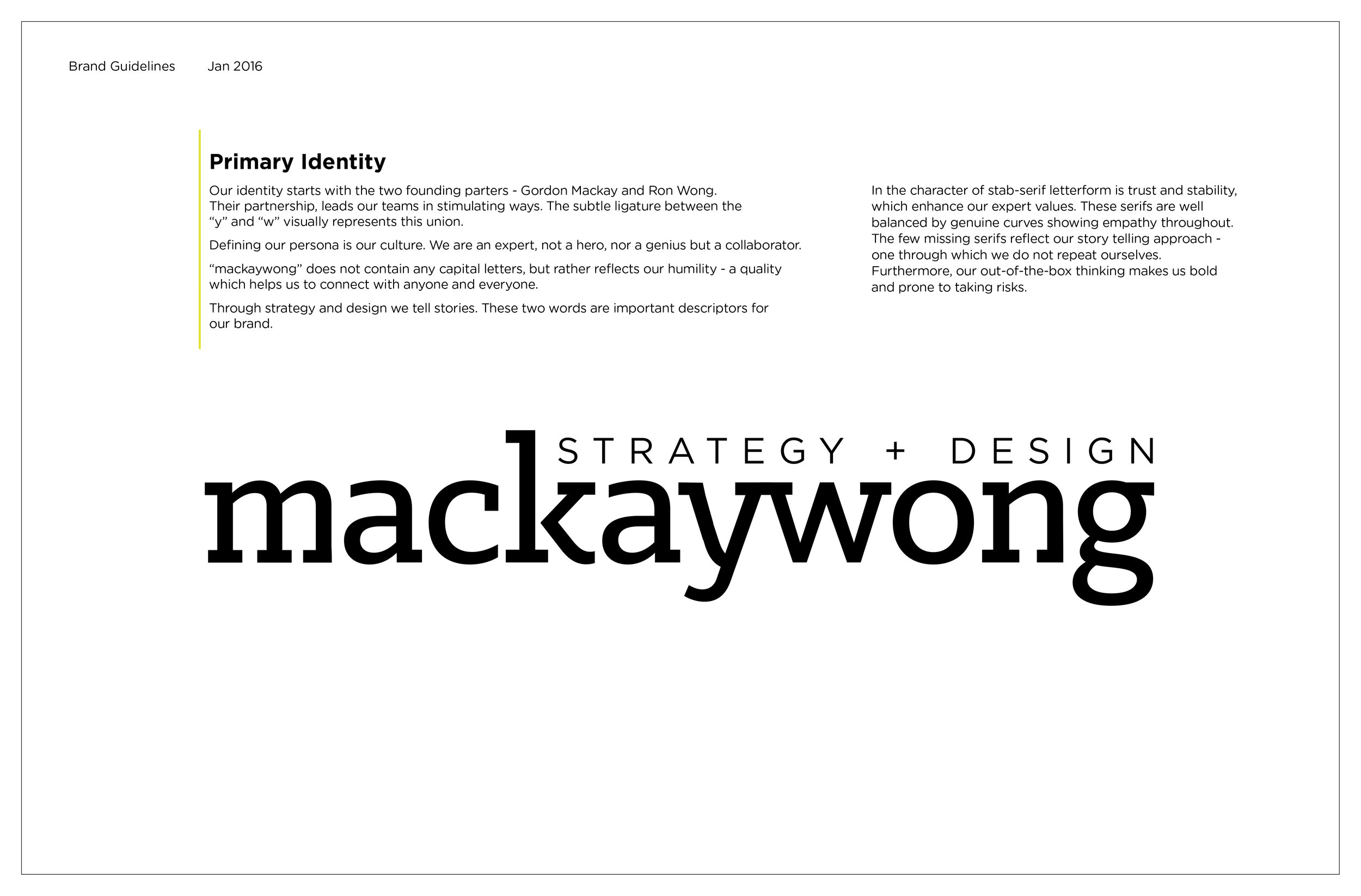
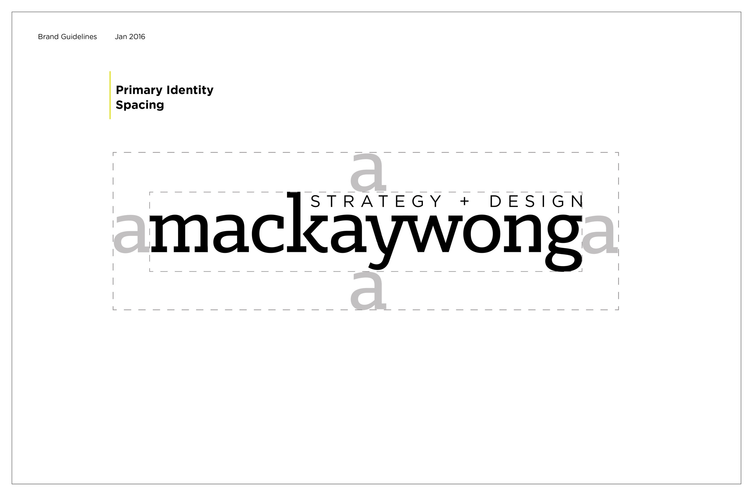
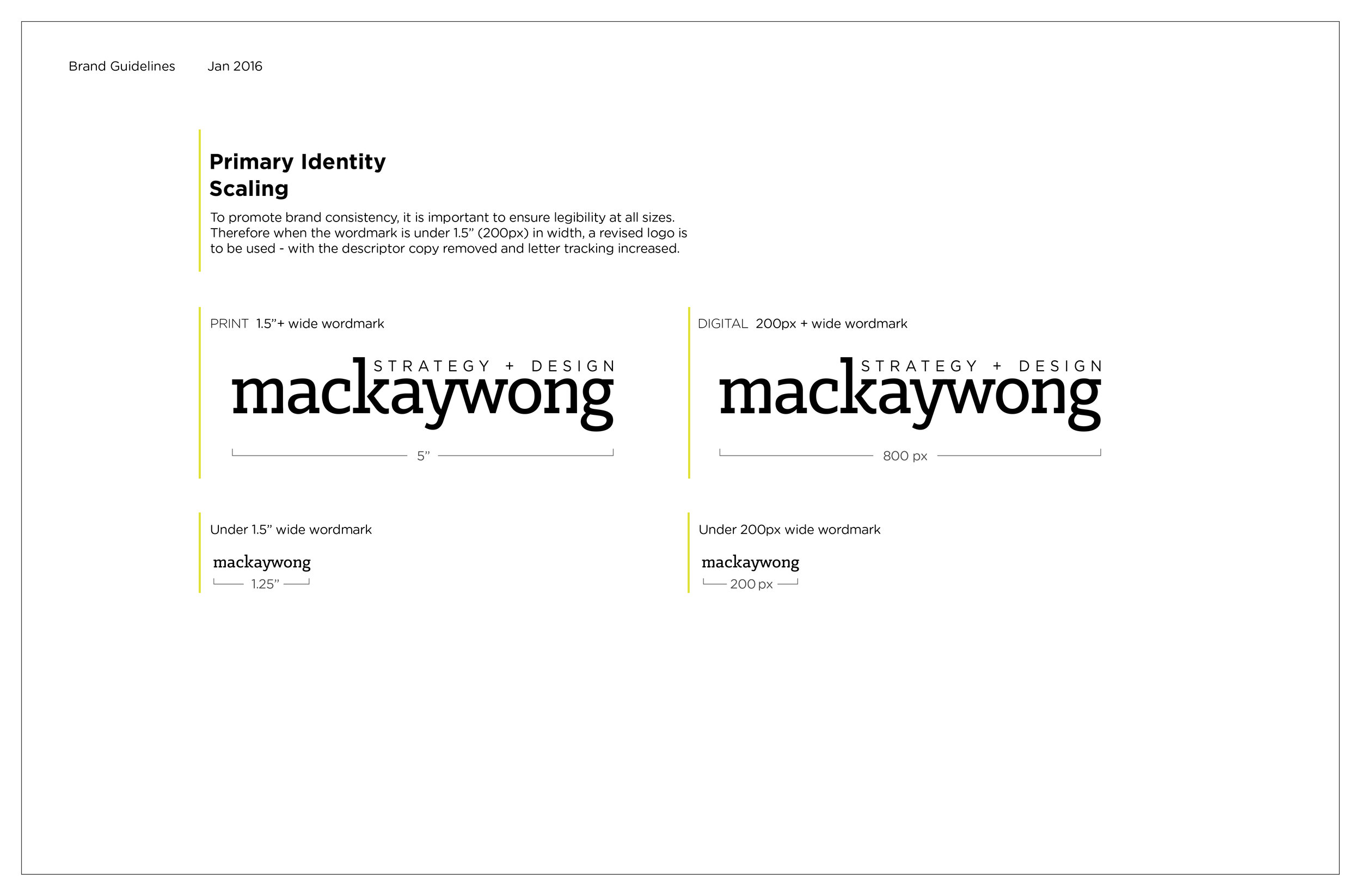
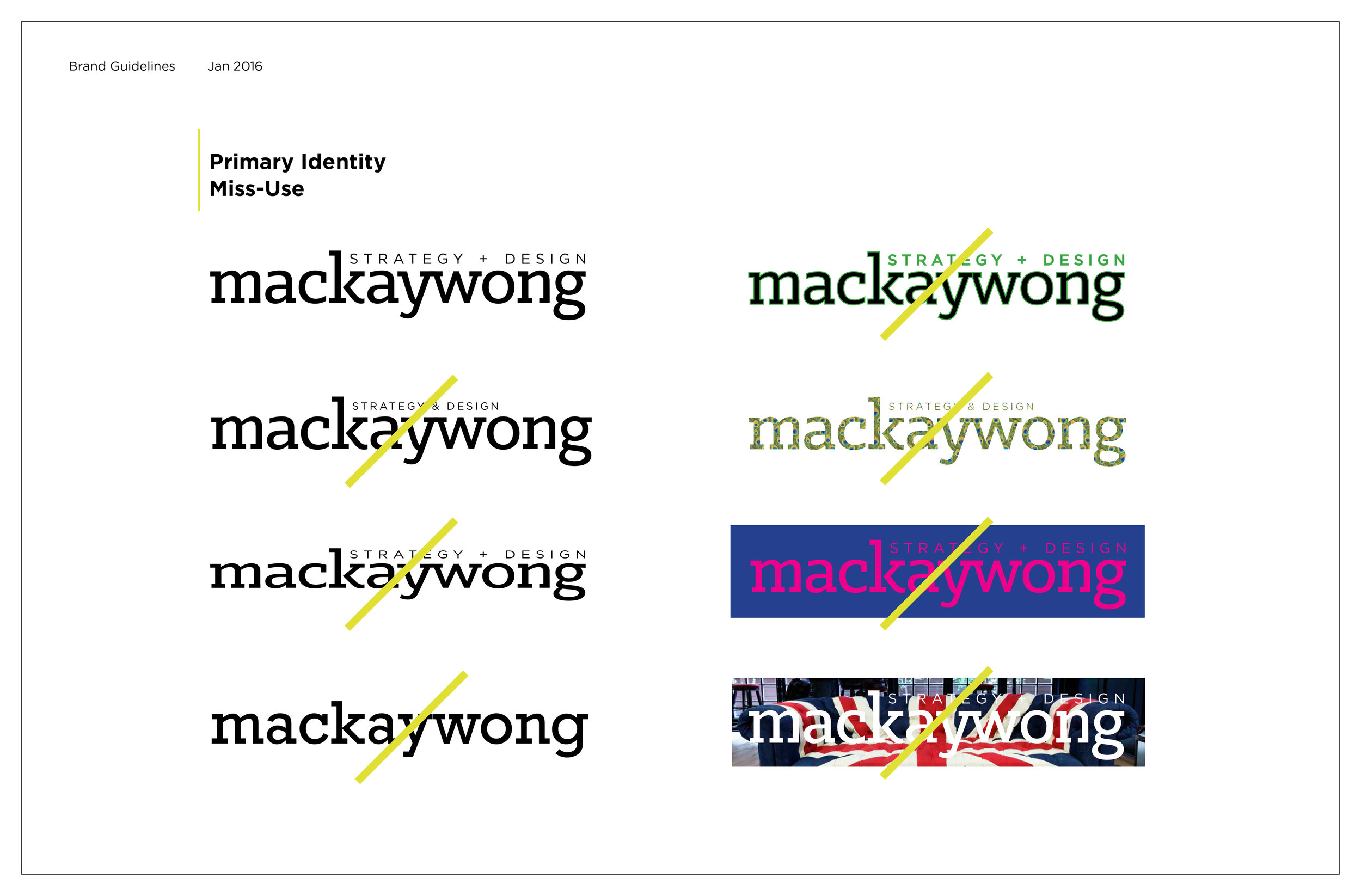
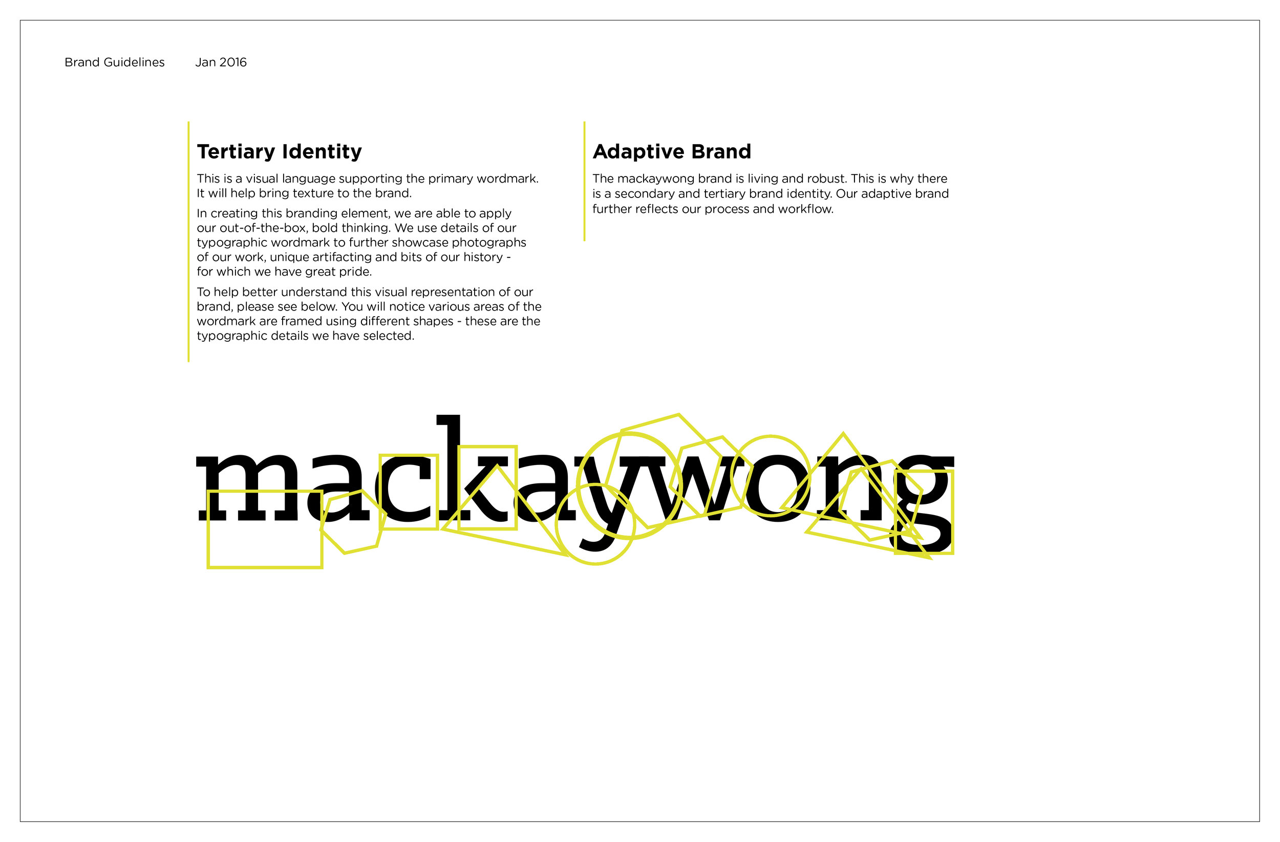
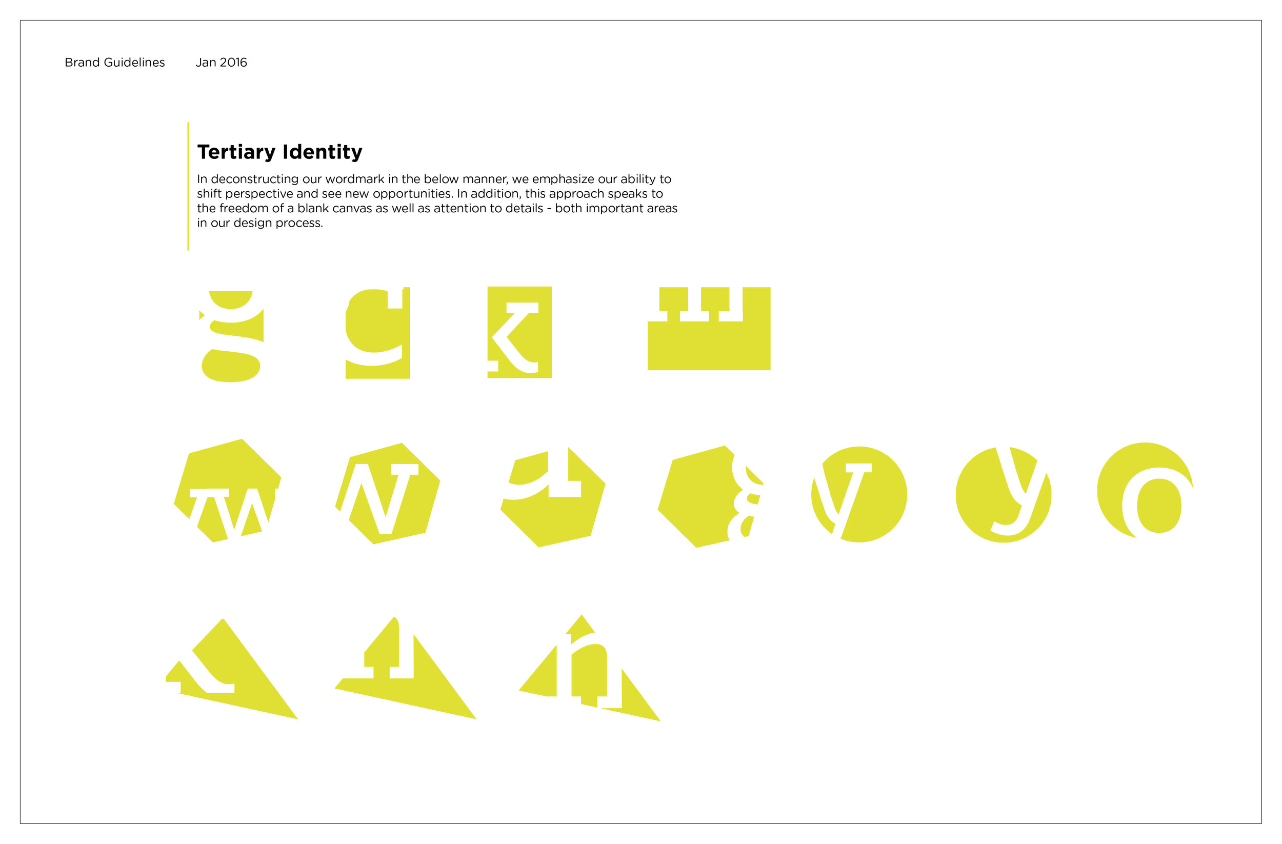
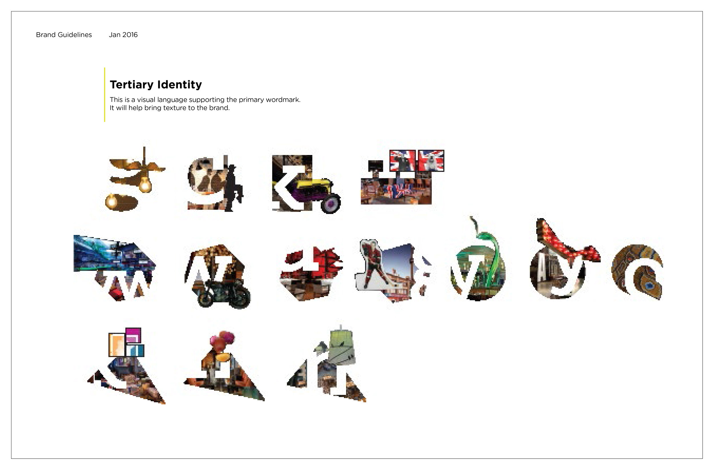
Through a collaborative process, I worked with my colleague to explore various logo options and present to the company owners. I developed the brand standards to help introduce the change in culture of the organization and set guidelines. I created a secondary visual language to support the brand and give it depth. This provided an additional opportunity to showcase the studio’s work, while adding a bold, creative side to the company.
Wordmark - Primary Brand Visual (above)
Scroll through to see various pages of the brand standards.
WEB DESIGN
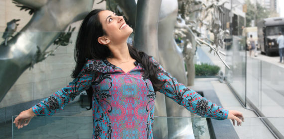
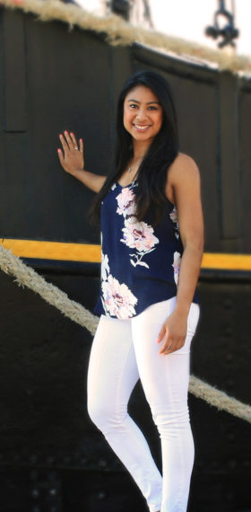
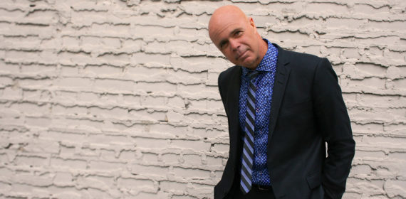
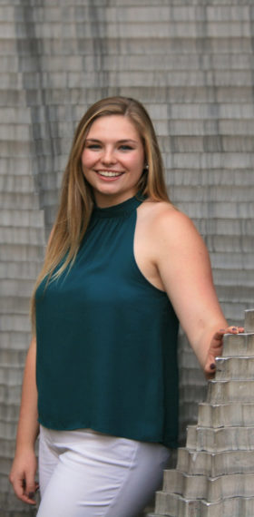
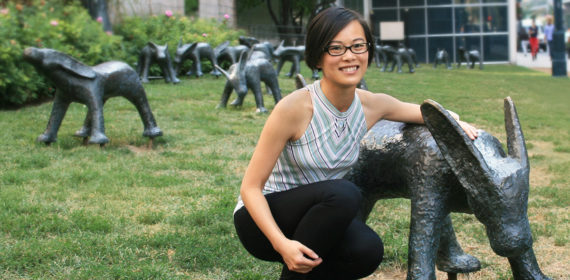
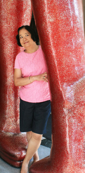
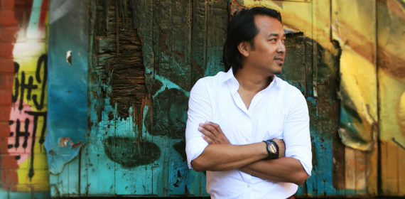
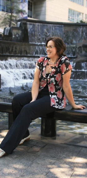
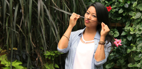
I advised on the website design and created an animation of the logo introducing the secondary visual elements to the online web presence. This loading animation added a unique, modern feel to the company. I also art directed and shot new portrait photos of the staff, as they each picked a Toronto spot they felt connected to, representing them and connecting the company to the city.
Secondary Visual Language (above)
Scroll through to see evolution.
Website Loading Animation (above)
Secondary Visual Language Used
COLLATERAL MATERIALS
Next, I created and improved company’s collateral materials, both internal and external. With internal documents such as forms and labels, I was involved in optimizing the way they are used and, of course, how they look. Business cards, letterheads, envelopes, on-site ads being part of the external collateral graphics were conceptually designed to help spark a conversation and present the company as bold, creative, adventurous, etc.
ENVIRONMENT
I activated an initiative to re-think the company’s interior space and spice it with new character, as quite a few suppliers and clients visit the space. I gave ideas to initiate a collaborative process, in approaching the graphics and signage.
Business Cards (above)
Each employee received three type of cards showcasing different project photos to be used as conversation starters.
Branded Construction Sign for Upcoming Projects
