MVMNT Health & Wellness
Brand Positioning, Visual Identity, Applications and Signage
August 2023
We worked with the business owners to create a visual identity package for MVMNT Health & Wellness - a new, modern RMT and chiropractor company which believes in continuous self-growth, self-discovery, getting out of your comfort zone.
“At Mvmnt Health & Wellness, we promise that working with us will help build strong, long-term habits - enabling you to succeed outside of the treatment space. We also promise to help guide you, empower you by using our best knowledge and tools to help you grow and improve.”
Led by the Sage archetype, with the brand values of balance, empowerment, as well as a progressive, holistic methodology and a proactive approach, we created a brand visual language to reinforce the brand positioning.
About the Visual Identity
As Found in the Brand Standards -
“This progressive, geometric icon is balanced in asymmetry. As both halves of it are needed to be stable, this touches on the company’s philosophy - we work on both physical and mental training to succeed. This logo also represents the mountainous landscape surrounding our location, as well as our clients’ and our ambition to reach high and keep on thriving after ups and downs. The visual is created from a flowing line, but also it has subtle details giving it depth and dimension. One might compare it to a geometric infinity symbol, as we work holistically and we believe that we never stop working on ourselves. The visual identity has both sharp corners and rounded ones, touching on our approachable staff and space as well as our empowering and balancing company brand values.
The sans serif font is clean, simple and progressive. With soft curves to corners, the company’s well-rounded and balanced philosophy comes through. Furthermore, “mvmnt” is set in lower case implying an approachable, casual feel, while the uppercase “T” helps with an even visual distribution and also a unique, memorable look. The good amount of space around each letter evokes calmness and clarity. “
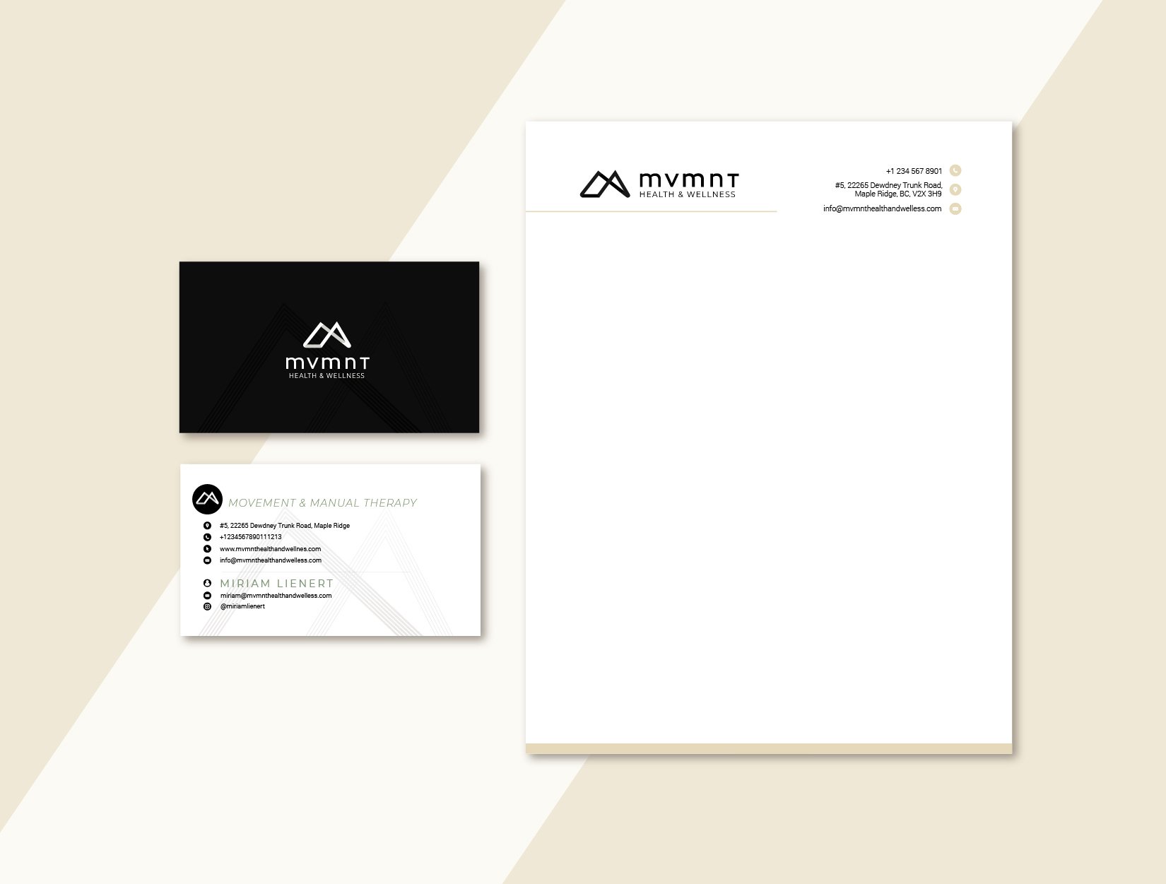
Stationary Package
Below are on-brand business cards and letterhead designs for Mvmnt Health and Wellness, to set the brand’s creative direction.
Signage & Window Graphics
An essential part of the brand elements, for a brand with a physical space, are the storefront signage and windowed graphics.
Below is an on-brand signage and graphics for the storefront ensuring the brand grows with consistent visual language around it.


