Geronimo Cafe
Statement Wall & Menu Boards
Spring 2018
Working with the owner, I suggested a few areas to focus on in order to enhance the interior while connecting it to the brand and improving the signage at Geronimo Cafe, Kemptville.
After establishing the brand personality traits, guiding principles, and making sure we understand the customers, our strategic design work kicked off. I suggested areas to focus on and the below creative direction was decided on for the various areas.
Design Process
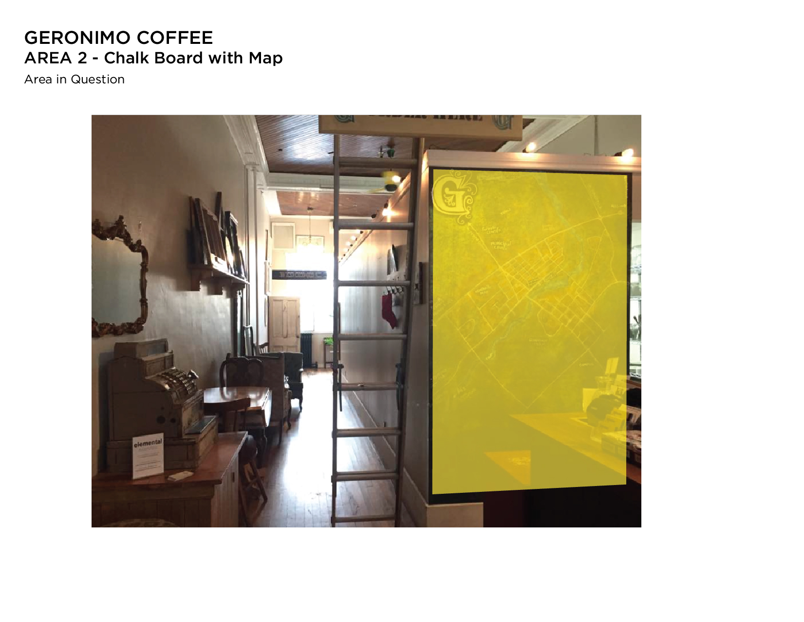
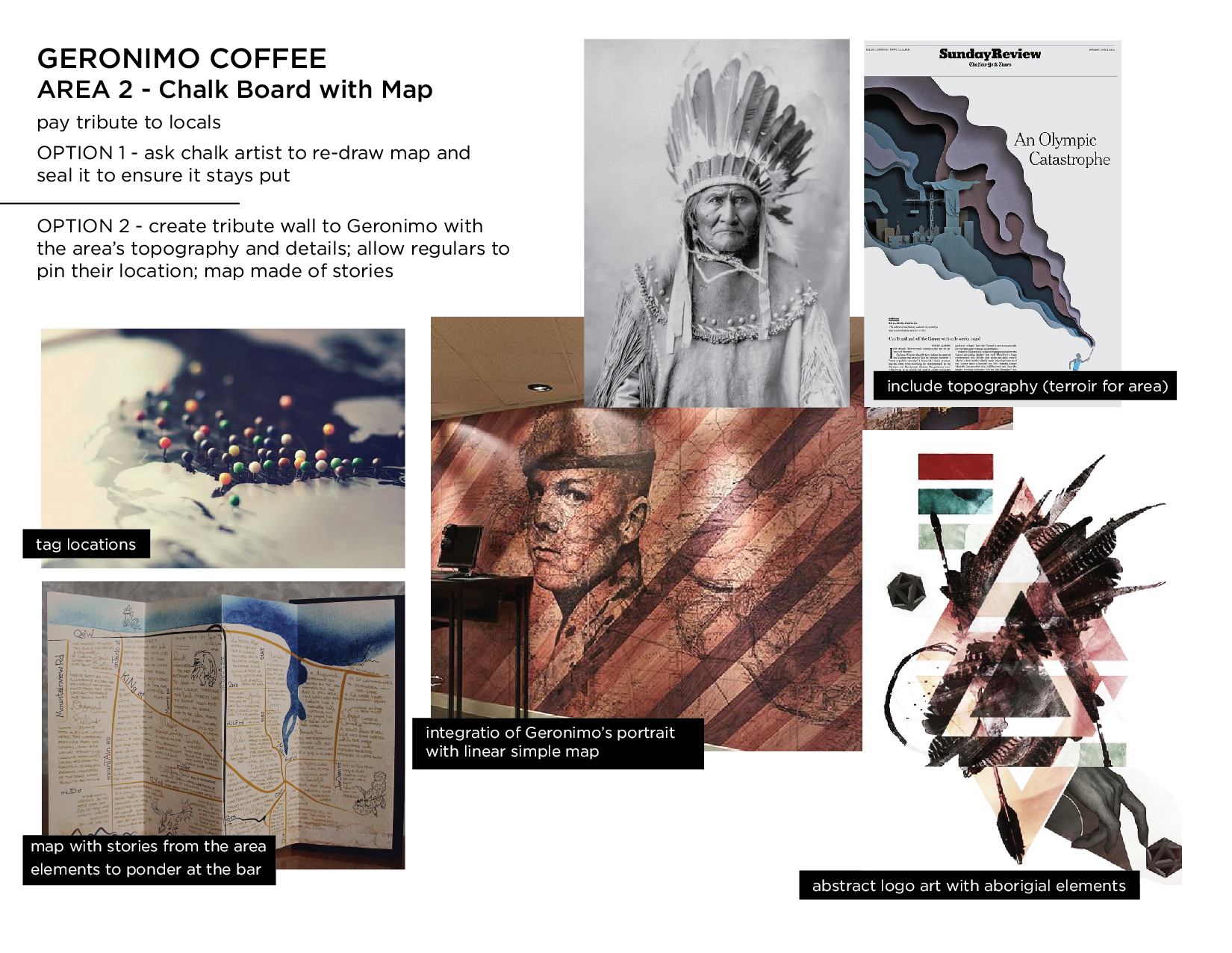
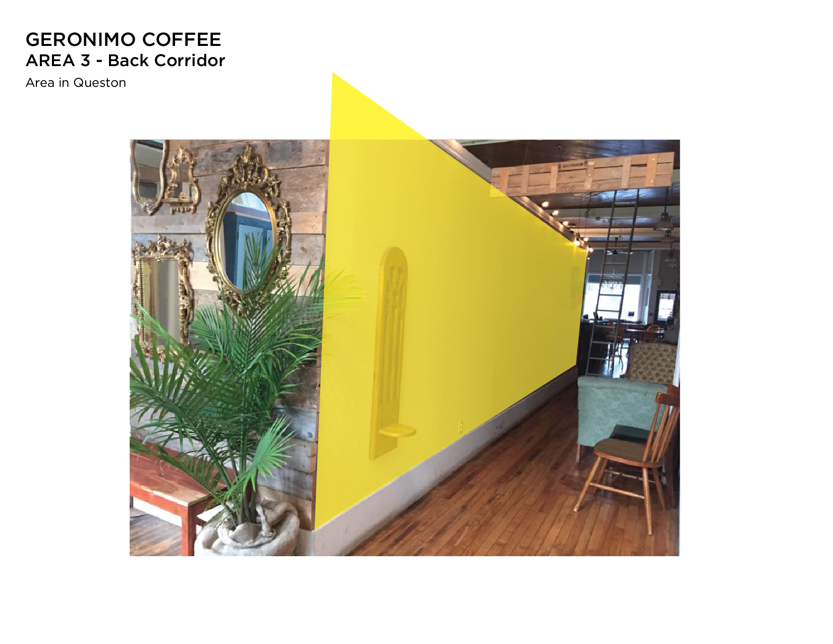
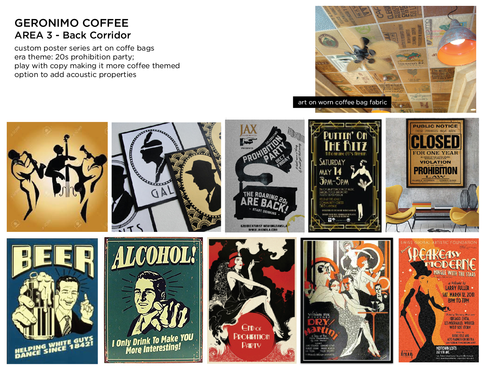
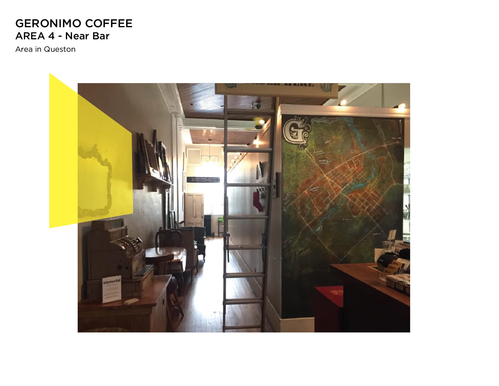
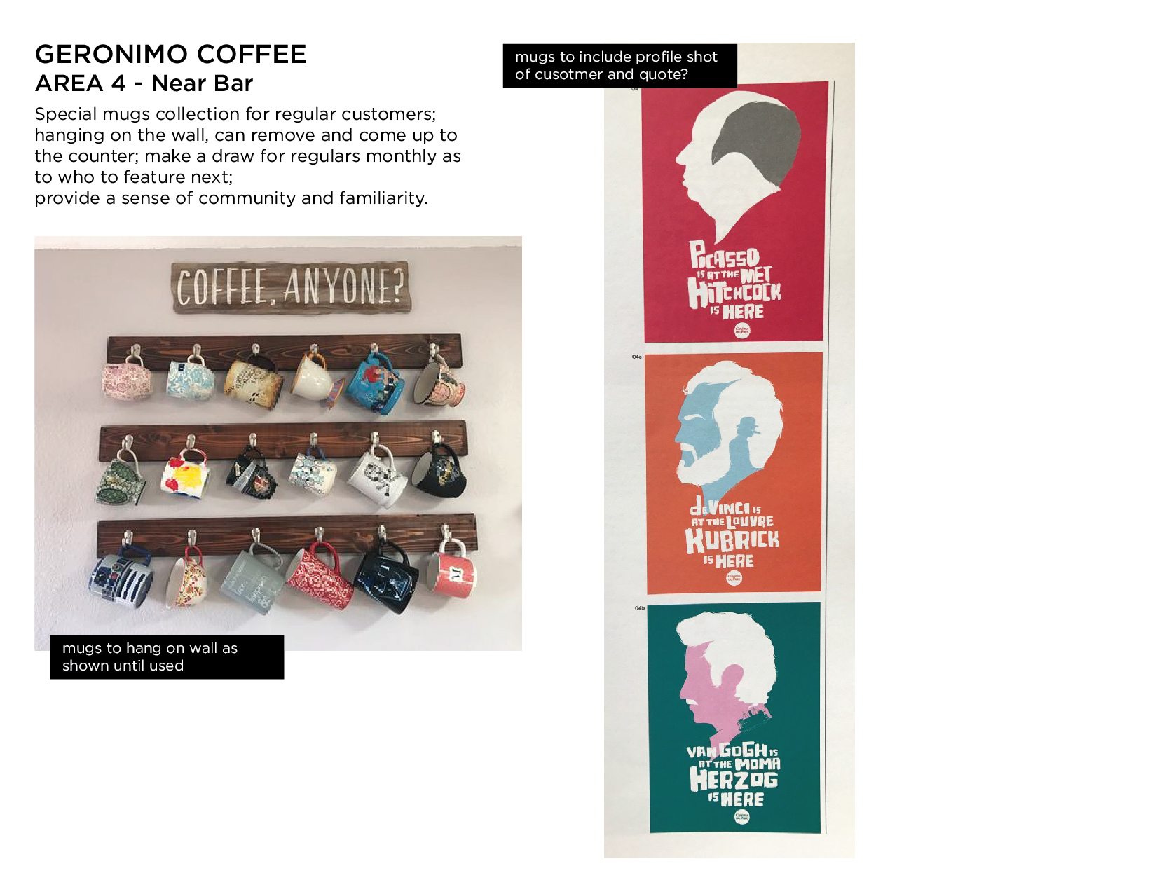
Geronimo is an engaging neighborhood meeting place and the following guidelines were kept in mind for the final design:
- be respectful of the town's pride and history
- keep a visual appeal attracting for all ages
- feel authentic and being memorable
- represent a brand character as progressive, outdoorsy, predictable, affluent.
The welcome wall and menus are the first elements for customers to encounter, hence crucial for shaping their opinion about the business.
![GeronimoCoffee_BrandStatement_Area1 [Recovered]-02.jpg](https://images.squarespace-cdn.com/content/v1/574365235559862ff404a3a9/1540840501868-EP4H9AGV0ZXRON37ZAK9/GeronimoCoffee_BrandStatement_Area1+%5BRecovered%5D-02.jpg)
![GeronimoCoffee_BrandStatement_Area1 [Recovered]-01.jpg](https://images.squarespace-cdn.com/content/v1/574365235559862ff404a3a9/1540840501978-R1C9SNUX9G0ZGGIIQ47W/GeronimoCoffee_BrandStatement_Area1+%5BRecovered%5D-01.jpg)
![GeronimoCoffee_BrandStatement_Area1 [Recovered]-03.jpg](https://images.squarespace-cdn.com/content/v1/574365235559862ff404a3a9/1540840503089-63TTKU7KU3JAD8G4R1ZQ/GeronimoCoffee_BrandStatement_Area1+%5BRecovered%5D-03.jpg)
![GeronimoCoffee_BrandStatement_Area1 [Recovered]-04.jpg](https://images.squarespace-cdn.com/content/v1/574365235559862ff404a3a9/1540840503350-T9Y1OQAFWVF6KPLJBG4L/GeronimoCoffee_BrandStatement_Area1+%5BRecovered%5D-04.jpg)
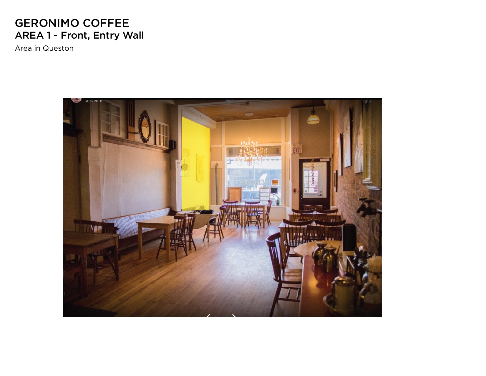
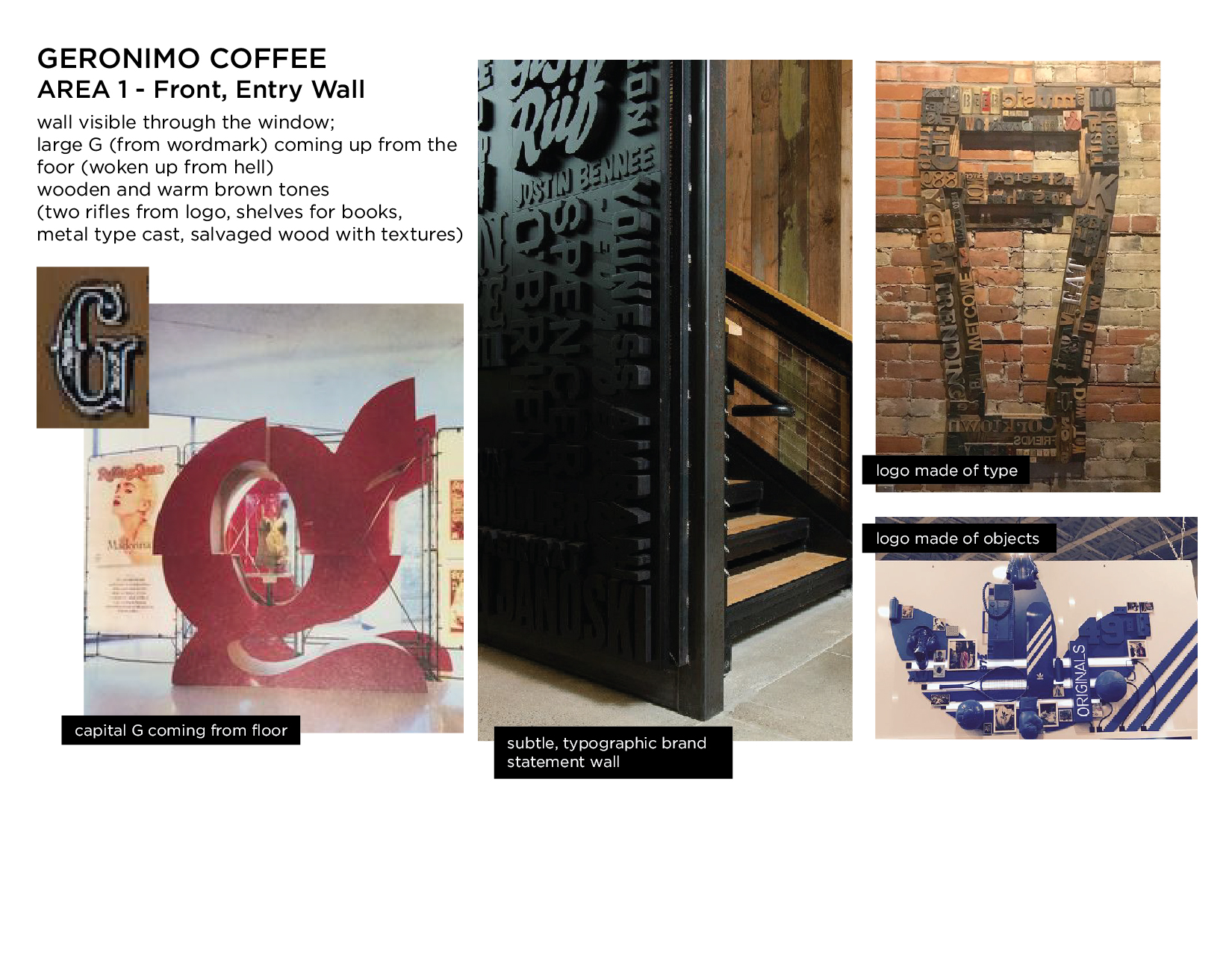
The first focus area was to create a brand statement wall visible from the large window for passerby. The element was also meant to play a role inside the main space. Drawing on many of Kemptville stories and histories, the art was designed as an interactive wall with memorabilia and elements to ponder upon.
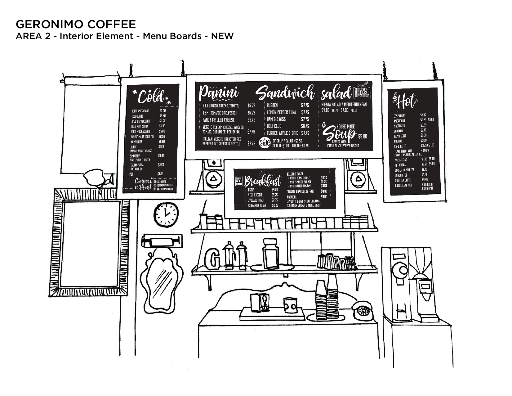
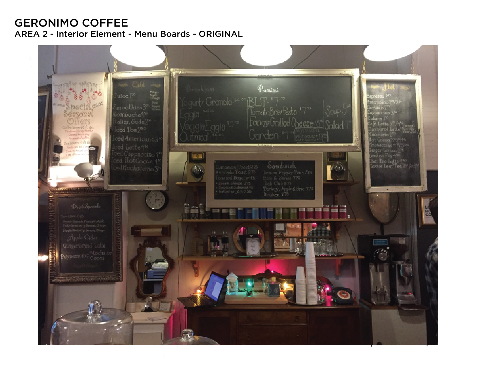
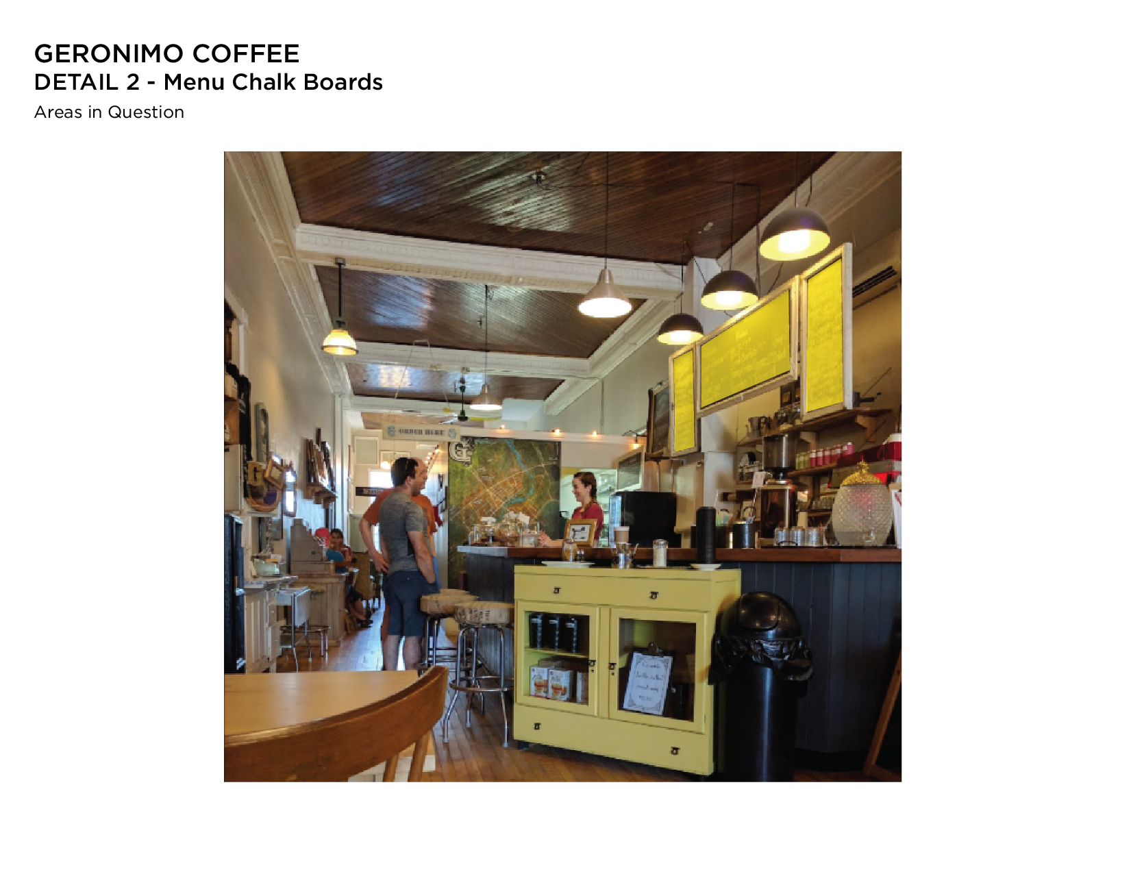
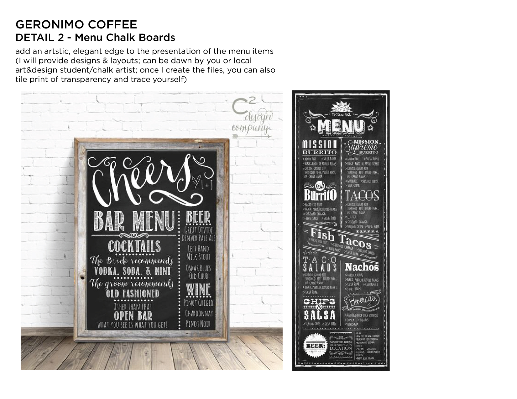
Next, the focus was to modernize and clean up the menu boards with the engaging designs.
Find improved design followed by a photo of the current menus.
