
Full Expression
Brand Positioning, Visual Identity, and Brand Standards
Jan 2024
A place where curiosity meets mastery, in the pursuit of excellence - that’s the spirit behind Full Expression. At IS Design Labs, we crafted this brand to resonate with those who refuse to settle for "good enough" — the cannabis growers who chase perfection, week after week. Full Expression was born for people like Jeff, the professional grower who strives to lead and influence in an industry where success is measured by the quality of each harvest. And Alex, the passionate home grower, who both enjoys the fruits of his labor and seeks to learn, share, and push his hobby to new heights.

Positioning Full Expression meant channeling the drive of those who believe in continual growth — people who are always looking to improve their process, refine their craft, and achieve better results. We shaped the brand as a solution for professional and hobbyist growers alike, bringing together the wisdom of experience with the curiosity to explore new frontiers.
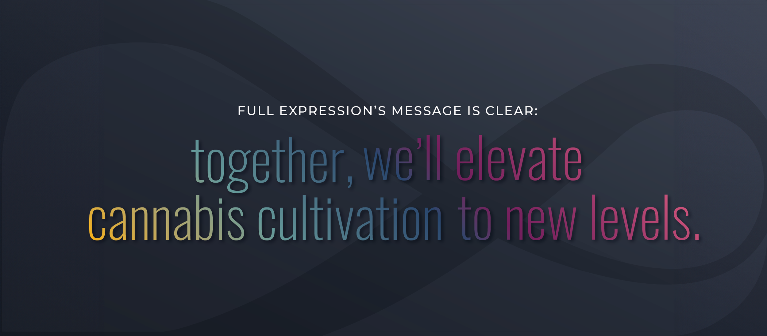
This isn't just about growth—it's about exploration and innovation. We designed Full Expression to lead with humility in an industry crowded with egos - focusing on collaboration, factual insights, and sustainable growth. Led by a scientist, Full Expression merges cutting-edge nanotechnology with a deep understanding of the plant, earning trust through proven expertise.
.
Naming & Visual Identity
The name Full Expression captures the very essence of what we set out to achieve—the complete realization of the cannabis plant’s potential. It’s about bringing forth the best that the plant has to offer, from trichomes to aroma, in a way that’s richer and more elevated than ever before. The name signifies the commitment to unlocking the full spectrum of what cannabis can be.

This story continues in the logo, where asymmetry meets elegance. The icon — a flowing "x" — embodies the intersection of ideas and innovation. It also mirrors the infinity symbol, a reminder that the journey of improvement never stops. This balance of rounded and sharp corners reflects the brand’s duality: man-made precision meets natural intuition.
The wordmark tells a similar story, combining the sophistication of a fluid script with the stability of a modern sans-serif font. The ornamental embellishment of the letter "F" speaks to the handcrafted passion behind the brand, while the clean lines of the sans-serif font reinforce Full Expression’s stable, logical side.
Colour Palette
Color plays an equally important role in telling this story. The palette is rooted in nature, inspired by the cannabis bloom itself — vivid, alive, and full of promise. It reflects the creativity, optimism, and grounded logic that define Full Expression.

At its core, the visual identity of Full Expression is a reflection of the brand's purpose: to guide, encourage, and inspire growers to reach their fullest potential, whether they are chasing mastery or simply curious about what’s possible. Together, we’re unlocking the future of cannabis, one bloom at a time.