Designing Cannabis Retail Stores
Authors: Tracy Ho & Mirna Aodesh, Black Bloom Studio & Iliana Sergeev, IS Design Labs
When you think of Cannabis, what’s the first thing that comes to mind? I bet it’s not interior design. Cannabis retail stores have been erupting all over the city since their legalization within the last few years and yet, we don’t ever stop to think – who created these spaces? The approach to good cannabis retail design relies on many key factors that work together cohesively. We want to give you a firsthand experience on the thought process behind a project of this caliber. So, we’re dissecting our very own award-winning: Qunubu Cannabis. A collaborative project for which we received an Indigo Gold in Hemp & CBD 2021 and is also part of the LICC (London International Creative Competition) 2020 Official Selection.
Are you excited?
Let’s get down to bud-ness...
There are so many important elements when considering cannabis retail design. We’ve broken it down to an easily compilable list for reference. Some of the most crucial aspects include: branding, accessibility, functionality, customer experience, and last but certainly not least, technology.
Branding in dispensaries (as in any retail situation) is incredibly important. You have to create something that is visually identifiable, memorable yet still holds some sort of mystery and novelty. A successful brand is rooted in research, positioned well in the competitive landscape, while touching the target audience and communicating the ideal brand values and personalities to start and maintain a trusting relationship. What is the story you want to tell your consumers? Branding can be as simple as the logo used on your merchandise all the way to the ambiance throughout the space. Okay, now that we’ve got you thinking… We can show you what we mean.
A little give and toke...
Okay, you’ve made it this far so let’s get the J rolling.
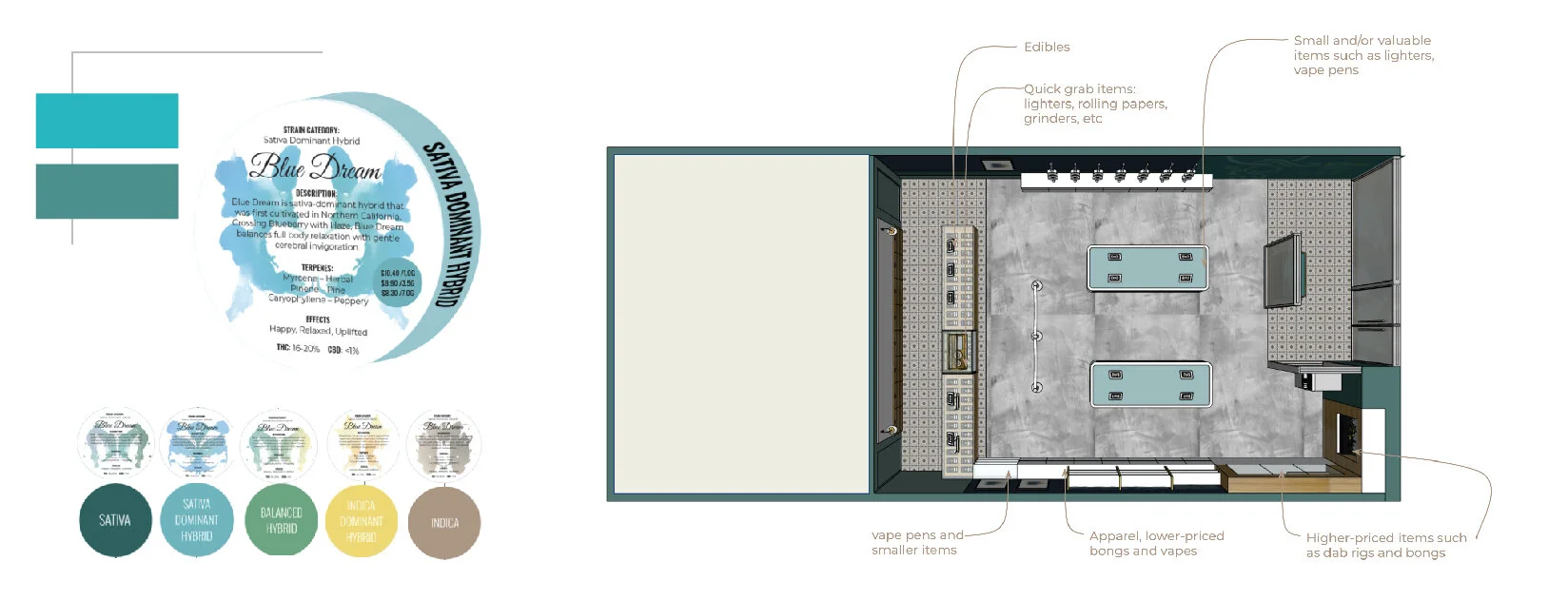
This branding originates from an ancient definition of the Assyrian language “Qunubu”; it is known as a way to produce smoke. It is important to immerse the culture of the brand wholeheartedly in history and knowledge. The visual identity of the brand is based on a circular shape. Why the circle you ask? It symbolizes the self, wholeness, and perfection. We wanted to create a break in that visual representation and conceptualized a swirl of smoke: this symbolizes the moments of recreation and a break from the daily hustle and bustle of life. A secondary visual we created was the application of ink blot art into the space. The Rorschach ink blots are used to analyze psychological interpretations. They represent our biases and our unique, personal way of thinking and emotions. The art draws from one of Qunubu’s core values – “we bring in a personal touch for customers and provide them with unbiased advice.” Furthermore, they are aesthetically pleasing and create an ambiguous interpretation of smoke. This is also used as texture; they are overlaid with gradients drawn from the colour palette. The gradients are used to help educate the guests on the different strains – which is almost implying that they are different personalities.
The visuals are employed throughout the entirety of the space in various methods.
Accessibility. This is quite important in any space and should be something that’s prioritized not only by designers, architects, and business owners. Accessibility in a dispensary may look a little bit different. See, the goal is to provide a clear and direct path for all users however, we need to be cautious in what we’re allowing the consumers to have access to. We didn’t want to design a space that would overwhelm users, after all - it’s quite literally the place you go to relax. The wayfinding in the space is set by projecting brand secondary visuals on the ground through an LED light in the ceiling plan. This is incredibly effective in terms of creating a clear path of travel and also it doesn’t add texture or graphics on the ground - which means, no maintenance in terms of the stickers peeling off, getting damaged etc.
There is no physical merchandise within reach of consumers, but technology and specific design elements have been put into play to provide the consumer with all the detail and knowledge they need. The intent was to create a space not only for the consumption of cannabis but also for it to act as a hub for the community. There are licensed professionals working behind the counter to assist with all the questions and to gain insight on this ever-growing industry.
Delving into the weeds of the design elements...
Qunubu Cannabis is a retail take on the local coffee shop using warm woods, concrete flooring, minimalist millwork design and warm lighting. The floor plan is quite straightforward in terms of it’s architectural components; we've created an open concept layout with a separation between private and public spaces. The front area of the space is for the public, whilst the back is for storage and staff only. The small items are displayed in the cash and wrap area while the higher priced paraphernalia is displayed behind glass cases. The center is where the technology is included in the customer experience. We created an area where clients can search through items on the iPads and learn about the products while having access to purchase.
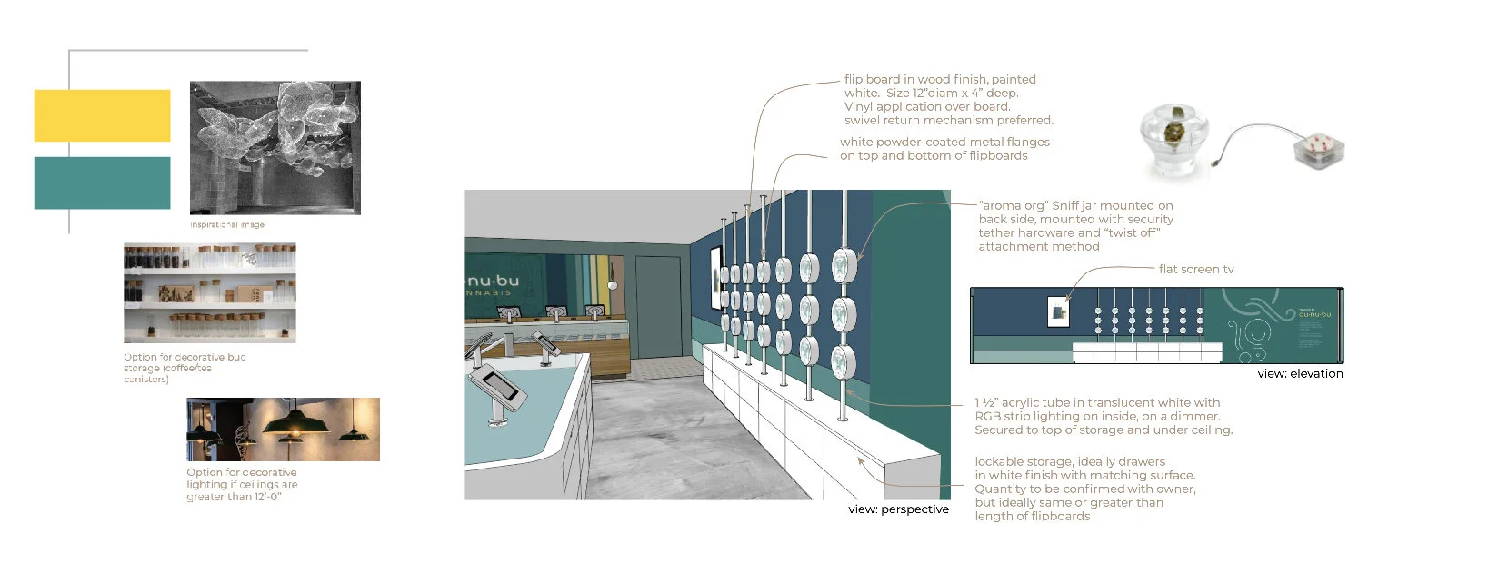
As mentioned before, it’s important that we educate the consumers because our main goal is to increase sales, support, and awareness. The central focus is the educational wall. It’s an encyclopedia-like flip wall for patrons to learn about each strain and bud that is offered at Qunubu. It is colour coded to help differentiate between the 5 different strains. Each circular flip element has information on one side and a circular box with the bud in question on the other. This stimulates the senses and creates a very interactive user experience while also maintaining its minimal aesthetic. We opted for keeping the sales floor minimal and extending the customers' reach to the inventory through the iPads. This creates a narrative about legalization and helps consumers navigate through this newfound world of legalized marijuana, and high-end luxury design.
Gone are the stone(d) ages
Gone are the days where you don’t have a brick and mortar location for consumption. We are in the avenue to create luxurious, warm, memorable experiences while also educating the masses. As interior and branding designers, we constantly strive to find creative solutions to any problem. Reach out to us and see how we can utilize our 15+ years of experience in collaborating on your next cannabis store.


