LOGO or BRAND
So many times I hear the request for a “quick logo, please”.
I want for all of us to understand the importance of a good foundation for a business, and how to have a strong launch with a complete toolkit for success.
I know of many people, who had a disappointing experience in the creation process of their logo, but there is a better approach to prevent such a frustration. First off, businesses should not start off just asking for a logo – the interest should be in getting a comprehensive visual identity to welcome the company into the wild world overloaded with media. This can be that precious first impression, that silent handshake to present your company and set an image within seconds. In reality, any new company starting out should invest in their brand. What is the difference?
The first definition of “brand” found in Merriam Webster dictionary is: “a mark made by burning with a hot iron to attest manufacture or quality or to designate ownership”.
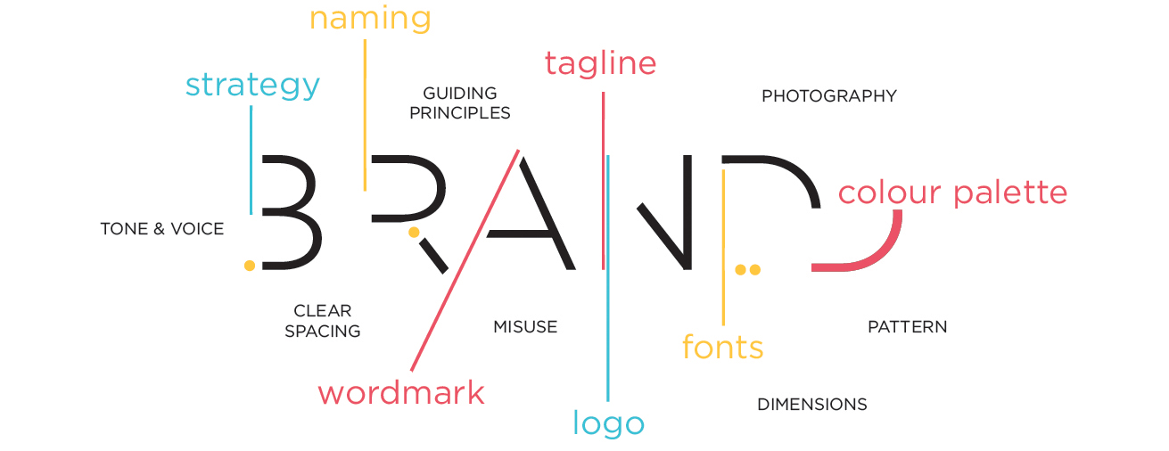
To update this archaic impression, a brand sets the tone about how your company is perceived. It begins with a basic brand strategy to pave the way, and help designers and business owners understand challenges in the industry. There should also be an examination of how the competitors are presenting themselves, an effort in finding out who this company will appeal to (your ideal customer), as well as an exercise in defining that competitive advantage to make the company unique - the positioning. Although, these might seem obvious to some of you, I cannot stress enough the importance for these aspects to be carved out and defined in both: the mind of the owner and designer. This way they are also clearly communicated between the two, ensuring both parties are on the same page, understanding the long-term goal of the company. We might employ the original Branding definition here and say: “burn these axioms into your mind to move forward successfully”.
Furthermore, this process sets the approach as some brands want to blend into a landscape of their industry; perhaps, create a narrative that they have been there for some time, while others try to add a unique edge by defying the conventional industry stereotypes and standing out. Only after understanding these various strategic aspects, can a designer truly come up with an intelligent solution for your company’s visual representation - to distill the essence of your enterprise. That is also the point for a truly successful naming exercise or explore a tagline. Upon creating a visual identity (logo/logotype), a full visual ecosystem is usually developed. This includes the rules around it’s use, such as spacing, background, fluidity for adaptation and various sizes.
Next, a colour palette is defined, which is an essential part; as the psychology of colour communicates and influences us on an entirely new level. It is believed that colour adds an emotional edge to communication – you might have heard that yellow evokes speedy ideas into our heads, while reds get our appetite going. But be careful, not all reds will do that, and neither will all shades of yellow get you to the desired outcome.
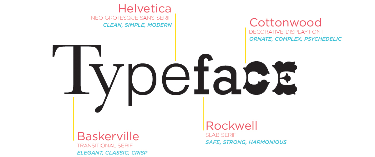
We also work on defining various font families. These can be used for a tagline or the writing of various communications and materials. There is a hierarchy of fonts to keep in mind, and some are used for headlines, others for sub-headlines and body copy. These styles work to complement the wordmark/logo and add another layer to the brand, as each font has its own history, personality, readability, and legibility.
There are more advanced options around setting the brand standards, which include the creation of a secondary visual language: the supporting graphics, patterns, and photography styles to work together with the logo/logotype to create a full visual identity for your company, essentially, set the right tone from all sides.
Having a complete package of standards ensures a successful launch for a company. These standards can be shared with a printer, web designer, sales reps or anyone else to guarantee that the visual representation of the company is always shining in the right light, setting the right expectation, and delivering that consistently firm handshake.


