AmeriVet Marketing Communications
Creative Direction of Brochures, Signs, Invitation, Presentation Template
There is always a lot of work going behind company's visual identity even though the first output commonly available to digest is the logo. The enterprise’s visual language is essential in setting the tone which will drive all future communications. This is why it is vital to have a brand strategy and strong positioning to solidify company’s direction. All visual identities must have brand standards to keep on point with projected message clarity.
It is essential to keep in mind that each point of interaction (business cards, brochures, advertisement, etc) will either reset or reinforce the company’s image in client’s eyes - this is as close as it gets to the actual physical interaction, the handshake of sorts. Imagine if you appeared drastically different at every business meeting, how well would that align with your message of consistency and commitment? There is no space for starting on the wrong foot in the world of design either.
I worked with AmeriVet Veterinary Partners Inc., an M&A enterprise focussed on veterinary practices in North America. I was in charge of integrating their visual identity into various communication documents. The ultimate goal was to set their creative direction, the visual look and feel around the brand.
In collaboration documents were created throughout our engagement:
- introductory brochure
- conference invitation
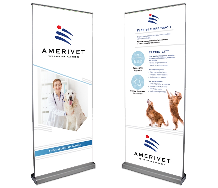
- conference banner stands
- booklet
- one pager slides
- presentation template
The art direction for AmeriVet is a simple, clean and modern. It sets the tone for transparency, security and enjoyment of life after retirement. The professional and approachable attitude is reinforced through the colour palette and the strategic choice of stock photography, as well as multiple subtle typographic elements and treatments. Plenty of whitespace and linear elements are there to build upon open-minded personality with clarity of vision. Larger, open, sans-serif body copy and generous leading helps elderly with readability, while the main Copperplate font gives a sturdy, secure vibe with old-fashioned values.
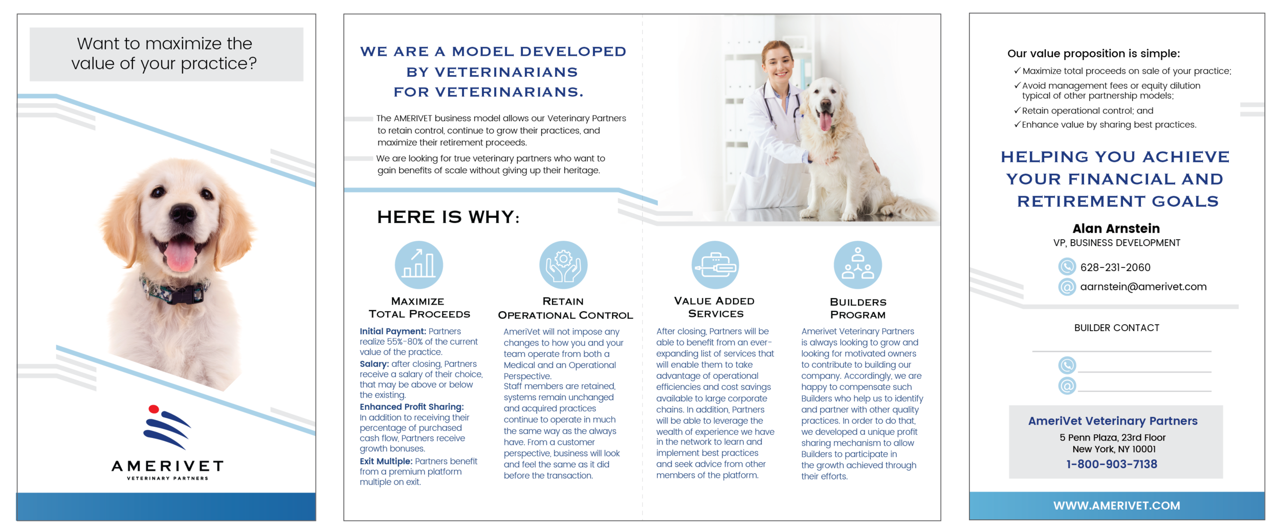
AmeriVet Brochure - 3 panel, 2 fold
(left) Front Panel
(left centre) First Unfold
(right centre) Full 3 Inside Panels
(left) Back Panel
AmeriVet - Leave Behind (5" x 8.5" folded)
(left) front panel
(centre) inside panels
(right) back panel
AmeriVet Retractable Conference Banner
AmeriVet Conference Invite 8.5x5.5
(left) Font Side
(right) Left Side


