Wong’s Ice Cream
Exterior Mural Signage
June 2019
IS Design Labs created a custom exterior signage, mural for a local ice-cream shop.
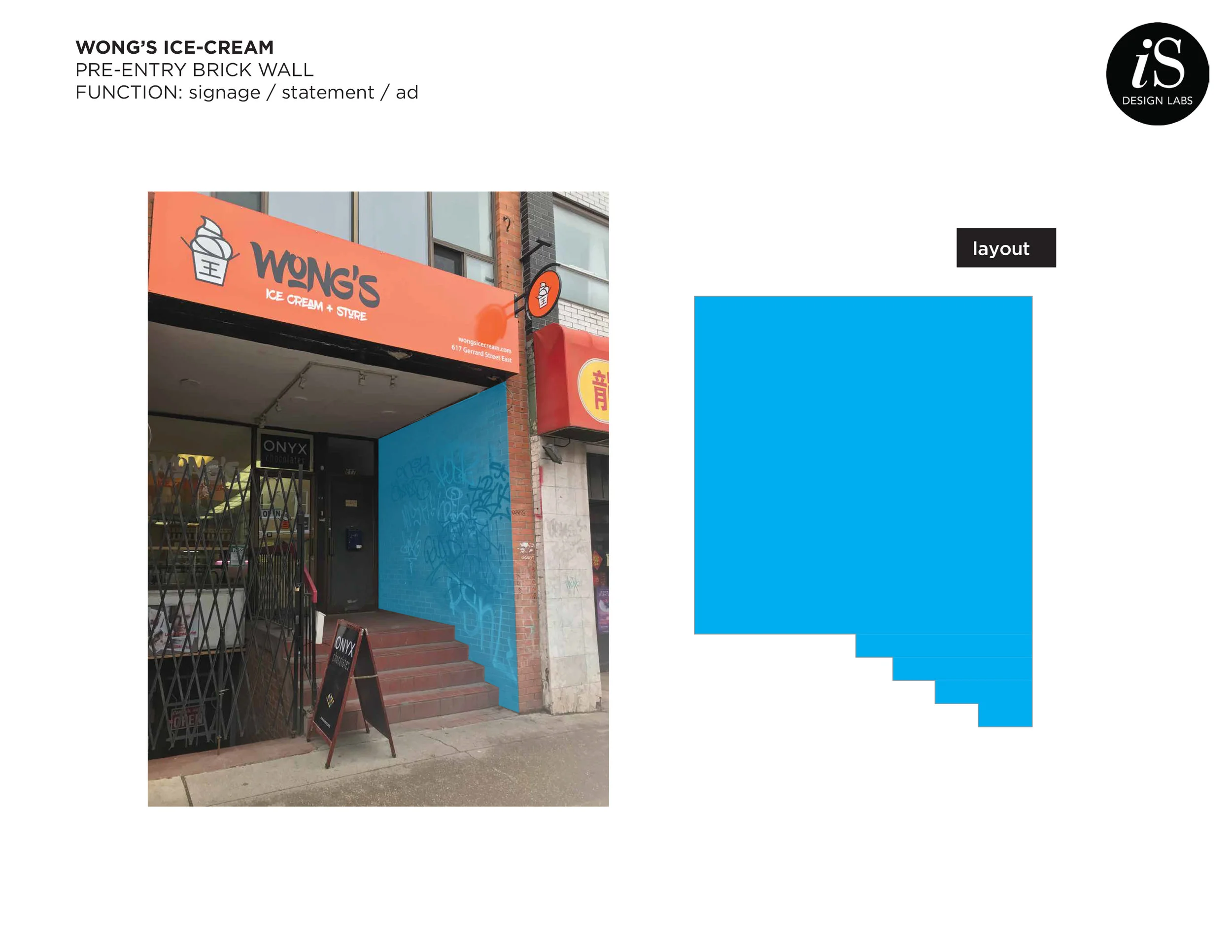
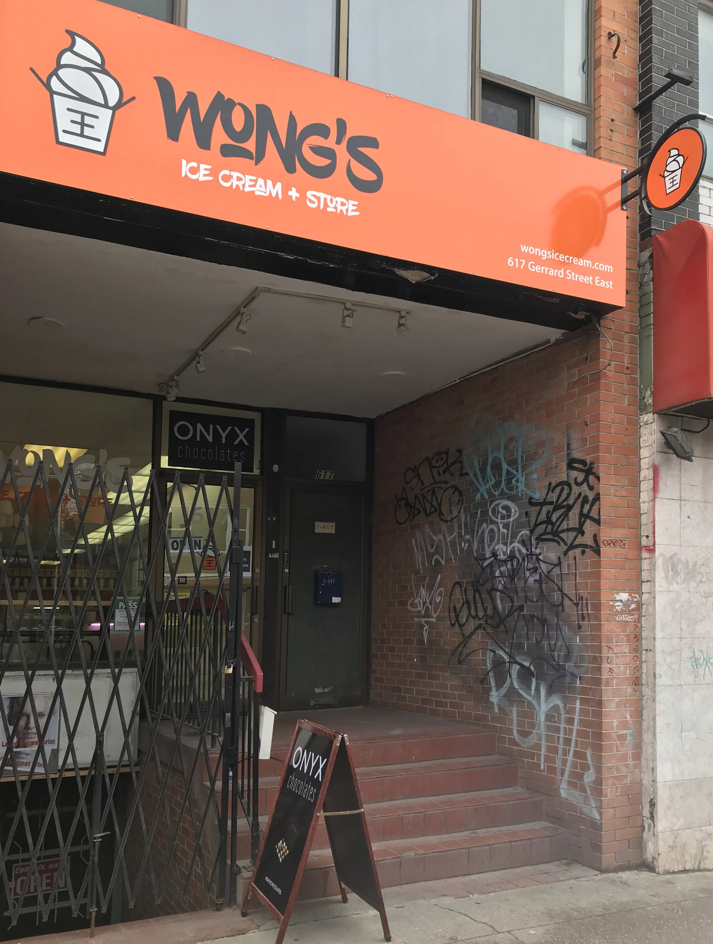
Wong’s storefront is recessed into the brick building, with entrance up a few stairs, through an exterior foyer. This makes the location hard to notice from the street. The small, circle hanging sign seen off the sidewalk is not enough to compete with the many stores in this busy Chinese market street.
With numerous graffiti tags on the existing foyer side wall, it was a wasted opportunity not to catch the passer-by’s attention with this brick wall.
Important to Note: The interior line art is subtle - letting the ice-cream flavours wow the customers, while with this exterior art, there was an opportunity to represent the richness of flavours with many enticing colours.
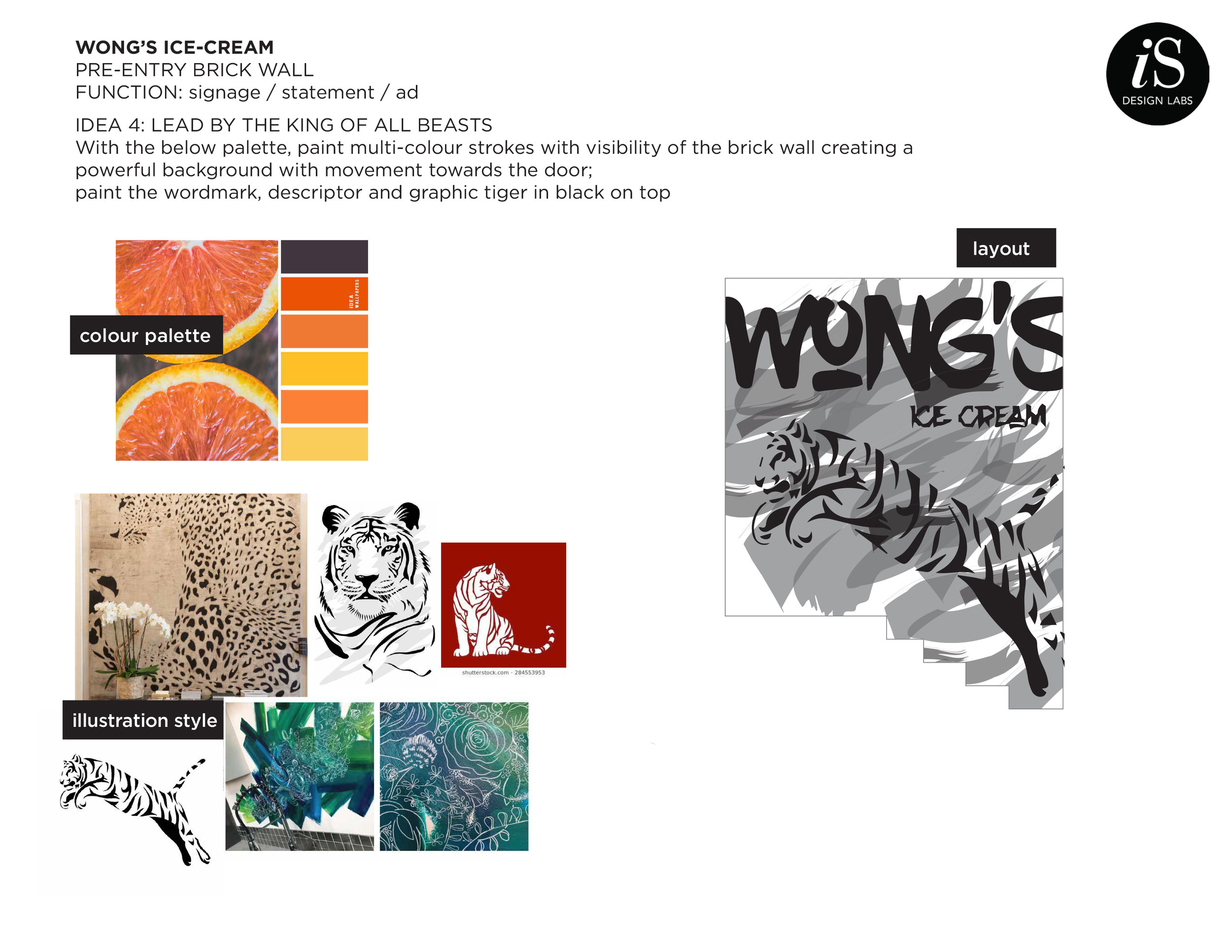
Concepts and Ideas
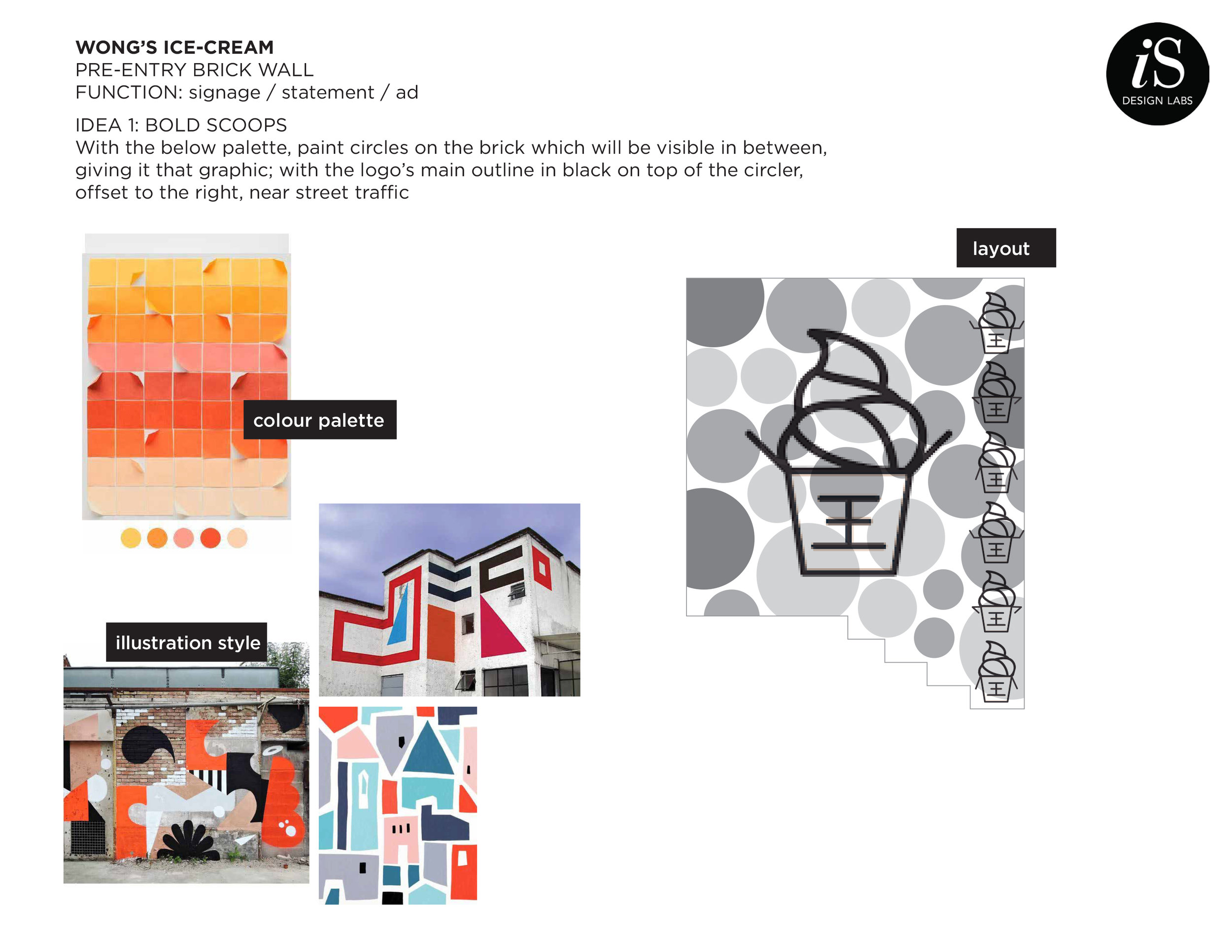
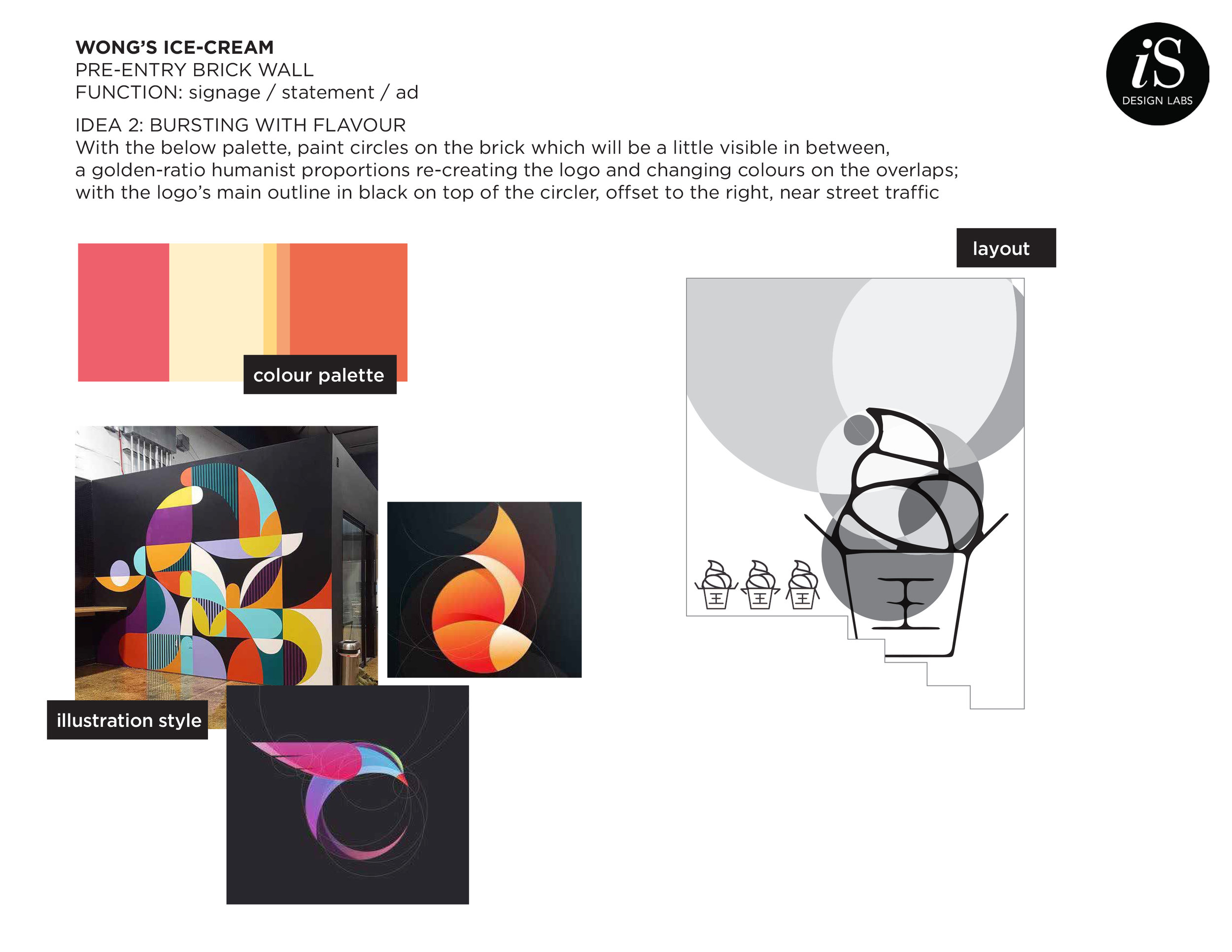
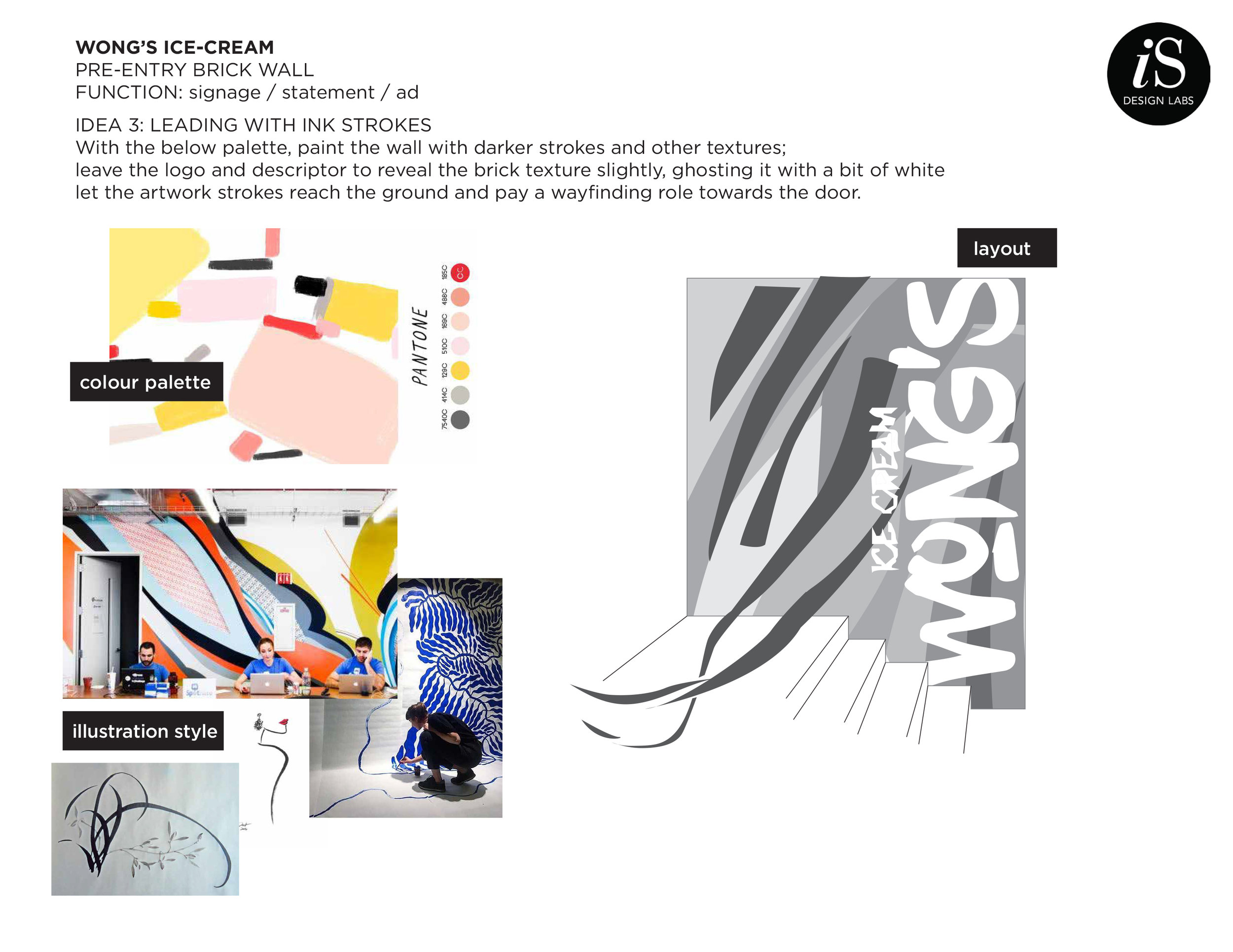
The below creative concepts were presented. The selected approach was IDEA 1: Bold Scoops. The art originates from a rule-of-thirds based ratio - circle elements in these proportions come together to create the ice-cream logo art.
Concept Narrowing and Definition
We decided to keep the brick look as part of the art, integrating with the existing street character, and the building’s brick facade. Most of the bricks were re-painted to look as if untouched (original).

